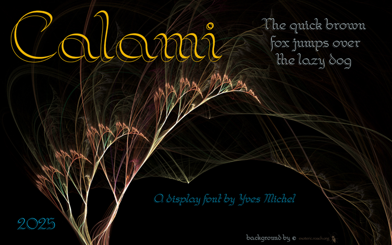
La police est inspir�e d'un exercice contenu dans 'The Zanerian Manual of Alphabets and Engrossing", ouvrage lui-m�me digitalis� par David Grimes (https://masgrimes.com/)
Je l'ai scann�e et digitalis�e puis redress�e � partir d'un italique n�gatif.
Il s'agit d'une police calligraphi�e avec une plume � double pointe (fine � gauche, large � droite), du type "Scroll Nibs 10" de William Mitchell Ltd, "Twin Nib" de Kaweco ou "Twin Italic point" de Bock.
___________________________________________________________
This font is inspired by an exercise in penmanship from "The Zanerian Manual of Alphabets and Engrossing", book digitized by David Grimes (https://masgrimes.com/)
I scanned and digitized it and transformed it from back italic to regular.
It' a calligraphic font made with a double-pointed pen (light on the left and broad on the right), like the "Scroll Nibs 10" from William Mitchell Ltd, "Twin Nib" from Kaweco ou "Twin Italic point" from Bock.
| Font name: |
Calami
  (0 reviews)
|
| Categories | Various, Fancy |
| Author: | Yves Michel |
| License: | Free for Personal Use |
| Files: | 3 |
| Views: | 0 |
| Downloads: | 0 |
Calami-Italic.ttf
Calami-Regular.ttf