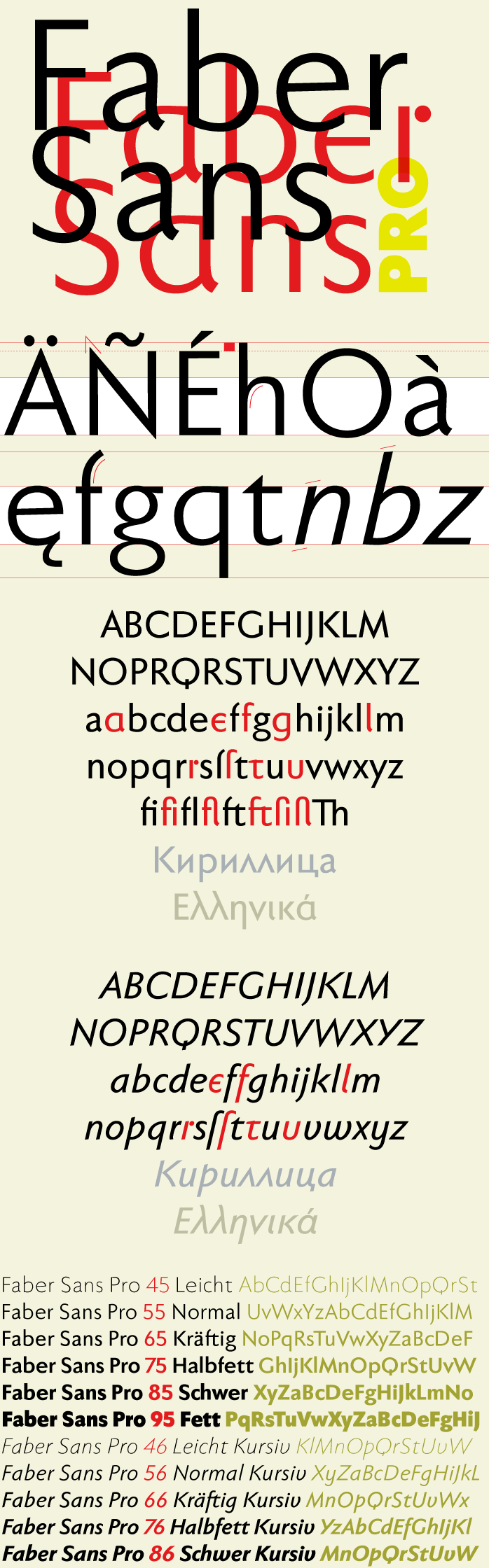
Font custom preview


Characters table sample

A A
B B
C C
D D
E E
F F
G G
H H
I I
J J
K K
L L
M M
N N
O O
P P
Q Q
R R
S S
T T
U U
V V
W W
X X
Y Y
Z Z
a a
b b
c c
d d
e e
f f
g g
h h
i i
j j
k k
l l
m m
n n
o o
p p
q q
r r
s s
t t
u u
v v
w w
x x
y y
z z
0 0
1 1
2 2
3 3
4 4
5 5
6 6
7 7
8 8
9 9
) )
! !
2 2
# #
$ $
% %
^ ^
& &
* *
( (
. .
/ /
; ;
' '
[ [
< <
? ?
" "
} }

Release note

Two fonts in one: a classic-modern sans serif appearing in two forms – "standard" and a "stylistic alternate" with uncial script-orientated characters which give the font a completely different "look."

The idea for one of the very first ingoFonts, the sans serif "Faber Eins & Zwei," originated in 1996. This typeface gained popularity over the years, especially in Anglo-Saxon countries. A lot has changed since then – not just in font technology. In 2010 it was time for a basic revision of this attractive font, and time to bring it up to date with current font technology.
A uniqueness of Faber Sans Pro is that it is actually composed of two fonts. The "basic typeface" is a sans serif in the classic-modern style of type creations of the early 20th century – godfathered by Futura from Paul Renner and Gill Sans from Eric Gill. The Roman Capitalis provided the model for the classically proportioned capital letters and the harmonic shapes of the humanistic minuscule for the lower case characters. And so a font with pleasant rhythmic proportions was created and is extremely comfortable to read, especially in large amounts of text; but, it is also reader-friendly under adverse typographic conditions on the monitor.

A "second" typeface with its own personal character resulted as stylistic alternates were designed for the letters a e f g l t u in accordance with the uncial scripts of the late antiquity or rather the early Middle Ages. And the r is given a playful point in the stylistic alternates. Modern OpenType technology makes it possible to combine the previously separate typefaces into one font. The stylistic alternate can be accessed via the OpenType-Functions »Discretionary Ligatures« or also » Stylistic Alternates« (and of course the glyph panel).
# File name Size 1 AGB_License_EULA.rtf 6.6KB 2 FaberSansPro45reduced.otf 9.5KB 3 FaberSansPro45reduced.ttf 27.3KB 4 FaberSansPro46reduced.otf 9.9KB 5 FaberSansPro46reduced.ttf 27.8KB 6 FaberSansPro55reduced.otf 9.5KB 7 FaberSansPro55reduced.ttf 23.7KB 8 FaberSansPro56reduced.otf 9.9KB 9 FaberSansPro56reduced.ttf 25.7KB 10 FaberSansPro65reduced.otf 9.6KB 11 FaberSansPro65reduced.ttf 23.7KB 12 FaberSansPro66reduced.otf 10KB 13 FaberSansPro66reduced.ttf 24KB 14 FaberSansPro75reduced.otf 9.7KB 15 FaberSansPro75reduced.ttf 21.8KB 16 FaberSansPro76reduced.otf 10.1KB 17 FaberSansPro76reduced.ttf 22.3KB 18 FaberSansPro85reduced.otf 9.9KB 19 FaberSansPro85reduced.ttf 20.9KB 20 FaberSansPro86reduced.otf 10.1KB 21 FaberSansPro86reduced.ttf 21KB 22 FaberSansPro95reduced.otf 9.8KB 23 FaberSansPro95reduced.ttf 20.4KB 24 FaberSans_Pro.pdf 1001.2KB 25 faber_sans_pro.png 199.4KB 26 FaberSansPro45reduced.woff 12.4KB