Laurel Or Hardy
Font name:
Categories
Author:
License:
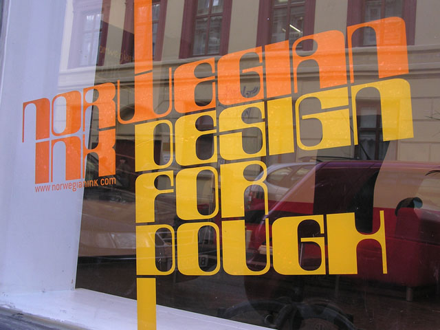
Website:
http://www.norwegianink.com
Files:
Views:
64
Downloads:
1
Rating:
Tags


