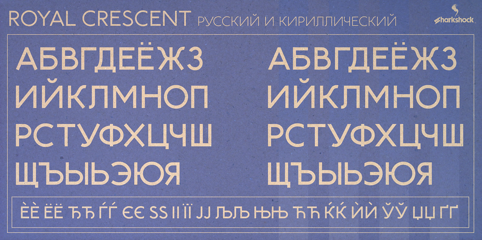
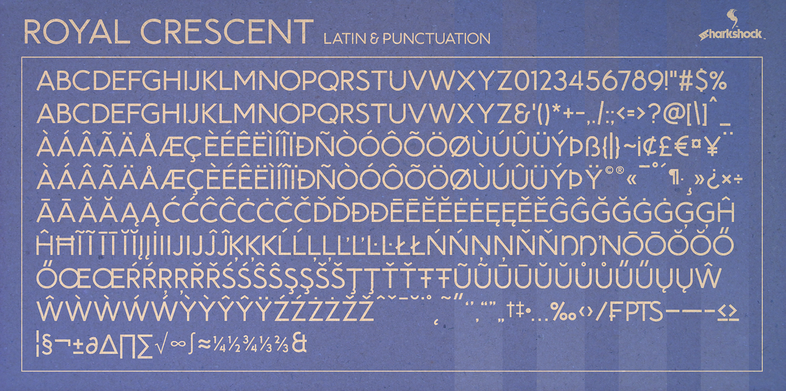
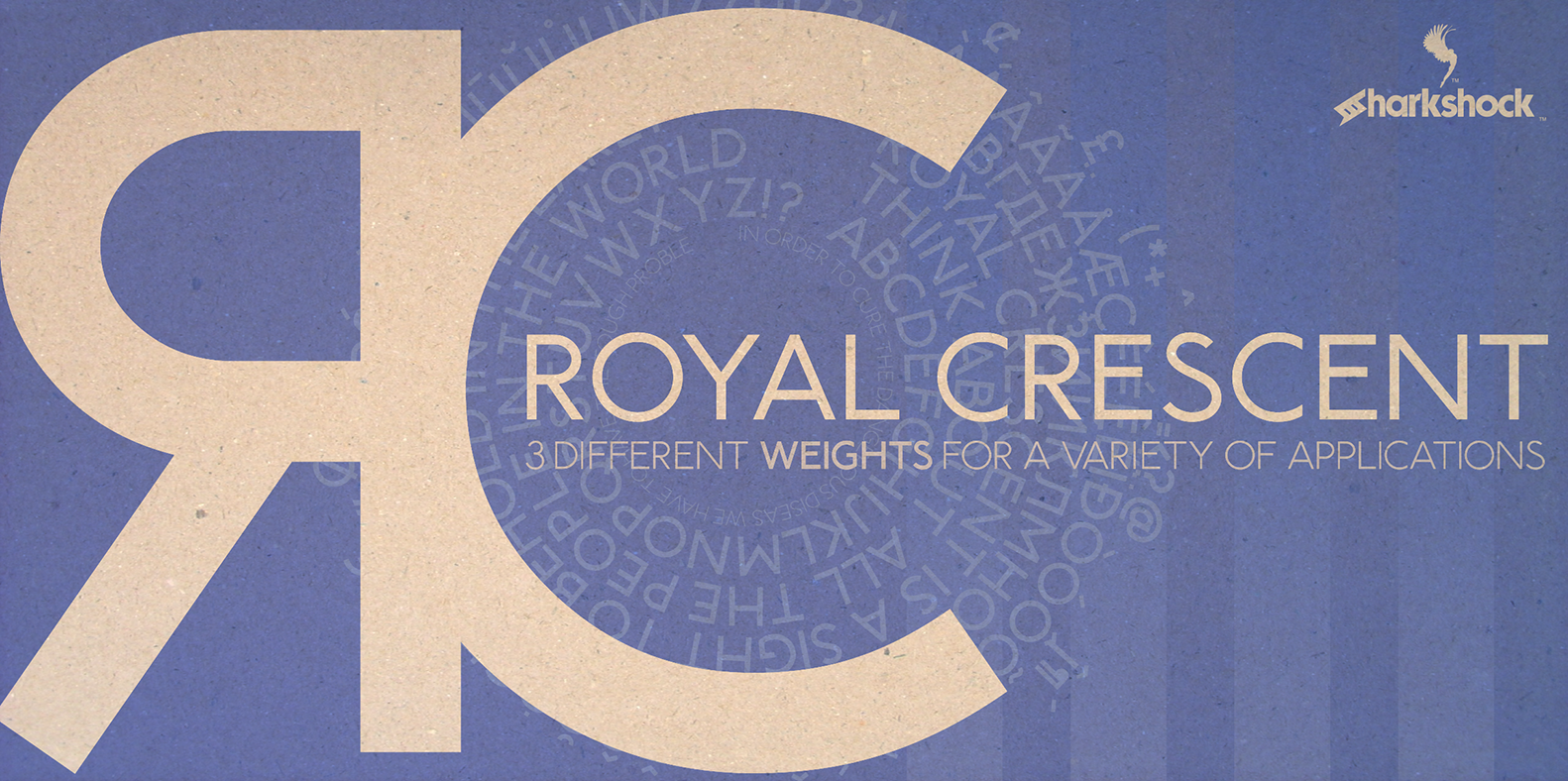
Font custom preview


Characters table sample

A A
B B
C C
D D
E E
F F
G G
H H
I I
J J
K K
L L
M M
N N
O O
P P
Q Q
R R
S S
T T
U U
V V
W W
X X
Y Y
Z Z
a a
b b
c c
d d
e e
f f
g g
h h
i i
j j
k k
l l
m m
n n
o o
p p
q q
r r
s s
t t
u u
v v
w w
x x
y y
z z
0 0
1 1
2 2
3 3
4 4
5 5
6 6
7 7
8 8
9 9
) )
! !
2 2
# #
$ $
% %
^ ^
& &
* *
( (
. .
/ /
; ;
' '
[ [
< <
? ?
" "
} }

Release note

OTF: Royal Crescent (Regular, Bold, and Light)
Dennis Ludlow 2017 all rights reserved
by Sharkshock
[email protected]

Royal Crescent is an all caps sans-serif based on Johnston, the font found on London’s subway stations. The uniform width is consistent throughout creating low contrast. There are slight variations, between several upper and lowercase characters which can be used interchangeably. Use Royal Crescent for a poster, a magazine, or company logo. There are 3 weights included in the full version. Basic/Extended Latin, punctuation, symbols, diacritics, Cyrillic, kerning, and fractions are all included. The demo includes basic Latin, numbers, limited punctuation, and limited kerning.

The complete version can be purchased for $20 via PayPal or by acquiring a commercial license. Do note that this $20 is for personal use only. Please email me or visit
http://www.sharkshock.net/license
for more information on licensing.

Thank you for your support!

visit
http://www.sharkshock.net
for more and take a bite out of BORING design!

tags: sans, sans-serif, Europe, Johnston, tube, underground, London, even, uniform, thickness, bold, subway, modern, style, Russian, Russia, Cyrillic, British, English, accents, European, diacritics, logo, publishing, company, Sharkshock, width

Font archive files

# File nam Size 1 readme.docx 12.3KB 2 Royal Crescent Cyrillic glyph map II.png 1.8MB 3 Royal Crescent demo.otf 164.3KB 4 Royal Crescent glyph map II.png 1.9MB 5 Royal Crescent II.png 1.8MB 6 Royal Crescent tube.png 373.4KB 7 Royal Crescent demo.woff 36.7KB